It is currently Fri Nov 29, 2024 7:43 am

All times are UTC - 6 hours [ DST ]


Post new topic Reply to topic  [ 1510 posts ]  Go to page Previous  1 ... 39, 40, 41, 42, 43, 44, 45 ... 76  Next
Author Message
PostPosted: Sat Aug 09, 2014 3:00 am 
Offline
Member
User avatar

Joined: Sep 23, 2013
Posts: 10342
Preferred Pronoun Set: BH/B.H./Bounty Hunter
Who removes page bread crumbs from the bottom? Seriously.

Now you scroll all the way down then ha e to go back to the top of the page and click next page.

_________________
"Life is like a Dungeon Master, if it smiles at you something terrible is probably about to happen."

Play-By-Post Games
Phandelver : IC / OC / Map


Like this post
Top
 Profile  
 
PostPosted: Sat Aug 09, 2014 3:02 am 
Offline
Desperately Wants A Custom Title
User avatar

Joined: Sep 23, 2013
Posts: 4754
Identity: Man
Who removes page bread crumbs from the bottom? Seriously.

Now you scroll all the way down then ha e to go back to the top of the page and click next page.

That and once you've already searched for something, further searches are by name only unless you restart at the Gatherer homepage. Ugh, there's just so many bugs.

_________________
quotes wrote:
squinty_eyes: Alt, you have fantastic logic. And zero political prowess.
CKY: Through a convoluted series of events involving three tons of garden gnomes and a pickup truck, Henderson’s Magikarp defeats the Deoxys terrorizing the city.

My Cube | My Designs | My Art
Silver Soraka Main


Like this post
Top
 Profile  
 
PostPosted: Sat Aug 09, 2014 3:21 am 
Offline
YMtC Champ '14
YMTC Pro Tour Champion
User avatar

Joined: Jun 04, 2014
Posts: 15598
Location: Freedom
Preferred Pronoun Set: they
magiccards.info you guys

:duel:

_________________
I tend to agree with Razor.

Mown wrote:
I'll never again complain about raz's criteria.


Like this post
Top
 Profile  
 
PostPosted: Sat Aug 09, 2014 3:35 am 
Offline
Desperately Wants A Custom Title
User avatar

Joined: Sep 23, 2013
Posts: 4754
Identity: Man
razorborne wrote:
magiccards.info you guys

:duel:

But magiccards.info doesn't have a picture of a killer planeswalker looming over you as you gripe and complain about it. Where's the fun in that?

Without detracting too much, maybe a "gatherer" addon to link to actual cards wouldn't be bad either for quick reference without having to swap tabs or windows etc.

_________________
quotes wrote:
squinty_eyes: Alt, you have fantastic logic. And zero political prowess.
CKY: Through a convoluted series of events involving three tons of garden gnomes and a pickup truck, Henderson’s Magikarp defeats the Deoxys terrorizing the city.

My Cube | My Designs | My Art
Silver Soraka Main


Like this post
Top
 Profile  
 
PostPosted: Sat Aug 09, 2014 3:40 am 
Offline
YMtC Champ '14
YMTC Pro Tour Champion
User avatar

Joined: Jun 04, 2014
Posts: 15598
Location: Freedom
Preferred Pronoun Set: they
altimis wrote:
razorborne wrote:
magiccards.info you guys

:duel:

But magiccards.info doesn't have a picture of a killer planeswalker looming over you as you gripe and complain about it. Where's the fun in that?

Without detracting too much, maybe a "gatherer" addon to link to actual cards wouldn't be bad either for quick reference without having to swap tabs or windows etc.

we already have that.

:duel:

_________________
I tend to agree with Razor.

Mown wrote:
I'll never again complain about raz's criteria.


Like this post
Top
 Profile  
 
PostPosted: Sat Aug 09, 2014 6:30 am 
Offline
Member
User avatar

Joined: Aug 05, 2014
Posts: 245
Crazy theme idea in my head. Had to get it out. I call it Ignited.

Current look for thread list:

Image

Current look for post bodys in a thread:

Image

This is what I would like to model the new theme after:
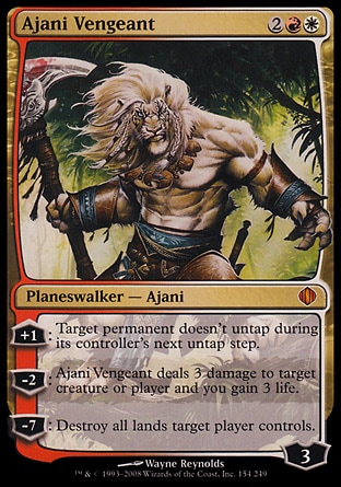
Image

Now picture your favorite color ( s ) and planeswalker and thats what the theme could feel like...

The post body in my head would be easiest to explain:

If you look at the Ajani card, you will notice the top and bottom brackets directly above and below the artwork. Well that would be the top and bottom brackets of a post.

The top bracket would have the users name on the left, then post subject and post time. Just like it is now just the new style of border / bracket.

The bottom would have all the things it has. Top, profile, pm, and quote buttons.

Then the Author and message areas in between the brackets would be shaped like the center box of the artwork box on the card. I had thought one box of that style for the author and another rectangle for the message box. Both having the rounded outside edges like the card. But possibly it would be better if it was one long rectangle for both with thin line to separate the two as it is now?

Then just like the card the bracket and center box or boxes would have the according color or colors of the selected theme outlining them thinly like the card. In this situation red / white. Or what ever your favorite color or colors are.

But then instead of the tan background it would be black. With this im referencing that tan color to the left and right of the post bodys. In the image its just that thin strip left and right. Or you could do a cool magic or D&D related image as the back ground and have the message box slightly transparent like the text box on the card so that the background image showed through but just slightly.

I dont have a precise idea developed on how to incorporate this idea into the main thread lists just yet. At least not a good way to describe it. But if you got any ideas to add to this. Please feel free. Even if its to talk me down from this. Please let me know if this is stupid or that nobody would even like it or care.

Sorry for the wall of text. Hope this was understandable?


Like this post
Top
 Profile  
 
PostPosted: Sat Aug 09, 2014 8:22 am 
Offline
Member
User avatar

Joined: Jun 21, 2014
Posts: 8338
Location: Singapore
I prefer the original version you posted.

_________________
Image
The format of YMtC and the Expanded Multiverse.
YMtC: My Deck of Many Things | NGA Masters | 2 | 3 | Roses of Paliano | Duel Decks: War of the Wheel | Jakkard: Wild Cards | From Maral's Vault | Taramir: The Dark Tide
Solphos: Solphos | Fool's Gold | Planeswalker's Guide | The Guiding Light | The Weight of a Soul
Game design: Pokémon Tales | Fleets of Ossia: War Machines | Hunter Killer | Red Jackie's Run


Like this post
Top
 Profile  
 
PostPosted: Sat Aug 09, 2014 8:38 am 
Offline
Member
User avatar

Joined: Aug 05, 2014
Posts: 245
I prefer the original version you posted.


Im thinking given a vote most would choose the same. Thanks for the feedback.


Like this post
Top
 Profile  
 
PostPosted: Sat Aug 09, 2014 1:22 pm 
Offline
Member
User avatar

Joined: Sep 19, 2013
Posts: 2156
Identity: Otter
Preferred Pronoun Set: Otterself
It looks nice hope that those who like it will use it,but I'll be sticking with my current look which was slightly inspired by the old d20 modern pergleemax look

_________________
Image


Like this post
Top
 Profile  
 
PostPosted: Sat Aug 09, 2014 3:26 pm 
Offline
Member
User avatar

Joined: Sep 23, 2013
Posts: 10342
Preferred Pronoun Set: BH/B.H./Bounty Hunter
:nonono:

_________________
"Life is like a Dungeon Master, if it smiles at you something terrible is probably about to happen."

Play-By-Post Games
Phandelver : IC / OC / Map


Like this post
Top
 Profile  
 
PostPosted: Sat Aug 09, 2014 11:49 pm 
Offline
Member
User avatar

Joined: Sep 22, 2013
Posts: 5699
Location: Inside my own head
Identity: Human
razorborne wrote:
magiccards.info you guys

:duel:

Quote for truth. Even the M15 scans on Gatherer suck, and there is no reason for them to.

The only thing Gatherer has going for it now is Fblthp showing up whenever you a card is linked incorrectly. (Or is that the main site?)

_________________
Bow before my King!
The King of the Warm Fuzzies
Feel the Warm Fuzzies!


Quoth the Raven, for truth.
Know your roots.


Like this post
Top
 Profile  
 
PostPosted: Sun Aug 10, 2014 12:22 am 
Offline
Member
User avatar

Joined: Jul 17, 2014
Posts: 308
Can someone explain to me how to change the name of a card when it's typed like this: Elvish Visionary. So if, instead of "Elvish Visionary", I wanted it to say "pudding", is there a way to do that?


Like this post
Top
 Profile  
 
PostPosted: Sun Aug 10, 2014 12:24 am 
Offline
Member
User avatar

Joined: Jun 21, 2014
Posts: 8338
Location: Singapore
[c=Elvish Visionary]pudding[/c]

_________________
Image
The format of YMtC and the Expanded Multiverse.
YMtC: My Deck of Many Things | NGA Masters | 2 | 3 | Roses of Paliano | Duel Decks: War of the Wheel | Jakkard: Wild Cards | From Maral's Vault | Taramir: The Dark Tide
Solphos: Solphos | Fool's Gold | Planeswalker's Guide | The Guiding Light | The Weight of a Soul
Game design: Pokémon Tales | Fleets of Ossia: War Machines | Hunter Killer | Red Jackie's Run


Like this post
Top
 Profile  
 
PostPosted: Sun Aug 10, 2014 12:29 am 
Offline
Member
User avatar

Joined: Jul 17, 2014
Posts: 308
Thanks so much!


Like this post
Top
 Profile  
 
PostPosted: Sun Aug 10, 2014 2:02 am 
Offline
Member
User avatar

Joined: Sep 23, 2013
Posts: 10342
Preferred Pronoun Set: BH/B.H./Bounty Hunter
Mmm Elvish pudding

_________________
"Life is like a Dungeon Master, if it smiles at you something terrible is probably about to happen."

Play-By-Post Games
Phandelver : IC / OC / Map


Like this post
Top
 Profile  
 
PostPosted: Tue Aug 12, 2014 12:13 am 
Offline
Member
User avatar

Joined: Sep 26, 2013
Posts: 2093
Identity: Male
Not entirely sure if this is the place for it, but in the Creative Corner the tag for written works is "Fiction". Since nonfiction is a thing too, it might be best to change the tag to "Writing".

_________________
"Body and spirit are sworn enemies. They will take any excuse to be rid of each other."
—Tariel, Reckoner of Souls


Like this post
Top
 Profile  
 
PostPosted: Tue Aug 12, 2014 3:03 am 
Offline
Former Staff
User avatar

Joined: Sep 20, 2013
Posts: 3240
It shall be so!

*Click*

In the future, if more content demands, we can always make a tag for Fiction and a tag for Non-Fiction.

_________________
No Goblins Allowed Code Of Conduct

D&D 5e Rules Q&A


Like this post
Top
 Profile  
 
PostPosted: Mon Aug 18, 2014 7:35 pm 
Offline
Member
User avatar

Joined: Sep 22, 2013
Posts: 5699
Location: Inside my own head
Identity: Human
Might I request that the Prefered Pronouns of people who have them appear in the full post editor page? It seems kind of against the purpose of the field if you can't see it while posting (I don't use the quick post whatchamajigger).

_________________
Bow before my King!
The King of the Warm Fuzzies
Feel the Warm Fuzzies!


Quoth the Raven, for truth.
Know your roots.


Like this post
Top
 Profile  
 
PostPosted: Mon Aug 18, 2014 11:57 pm 
Offline
Member
User avatar

Joined: Sep 26, 2013
Posts: 2093
Identity: Male
How about an eyeroll smiley?

_________________
"Body and spirit are sworn enemies. They will take any excuse to be rid of each other."
—Tariel, Reckoner of Souls


Like this post
Top
 Profile  
 
PostPosted: Tue Aug 19, 2014 1:29 am 
Offline
Former Staff
User avatar

Joined: Sep 20, 2013
Posts: 3240
:roll:

We had the animated version too but im not seeing it now. Shall have to re add it.

_________________
No Goblins Allowed Code Of Conduct

D&D 5e Rules Q&A


Like this post
Top
 Profile  
 
Display posts from previous:  Sort by  
Post new topic Reply to topic  [ 1510 posts ]  Go to page Previous  1 ... 39, 40, 41, 42, 43, 44, 45 ... 76  Next

All times are UTC - 6 hours [ DST ]


You cannot post new topics in this forum
You cannot reply to topics in this forum
You cannot edit your posts in this forum
You cannot delete your posts in this forum
You cannot post attachments in this forum

Jump to:  
Powered by phpBB® Forum Software © phpBB Group