It is currently Sat Nov 30, 2024 11:13 pm

All times are UTC - 6 hours [ DST ]


Post new topic Reply to topic  [ 74 posts ]  Go to page Previous  1, 2, 3, 4
Author Message
PostPosted: Mon Sep 30, 2013 7:15 am 
Offline
Member

Joined: Sep 24, 2013
Posts: 8786
Taking a closer look at Magic art because of this thread. (Only a few sets ago I started looking at the visual spoiler for the art and not just reading the card mechanics. However, I think the art was always something that subconsciously drew me into the game. It was when Shards of Alara came out that you could not help but notice the art and whether it's true or not I really felt like they started to put more effort into it around that time).

The original moxen have pretty cool backgrounds, something I didn't notice before.

Dan Scott's got some good pieces and certainly not visual adhd. Edge of the Divinity and Feudkiller's Verdict are pretty awesome.

Sometimes I really like the weird stuff like Wall of Light and Voice of All. A recent card I like is Polis Crusher, the perspective is perfect.

I remember that there was some pretty horrible art back in the day so I decided to have a look at The Dark. I think I didn't go back in time far enough but oh well, found examples of good and bad here. Obviously there is the iconic Blood of the Martyr and Elves of Deep Shadow, but I picked a few others to look at.

Fellwar Stone looks like something I could have done, but it's probably a lot harder than it looks.
Carnivorous Plant is kind of iconic, at least I remember seeing it a lot as a kid. I like the color scheme but it could be a bit bolder.
Book of Rass is not very good. I guess the art description is a book flies off a library shelf towards the viewer. They could do a lot better with that description these days.
Festival has horrible colors, even if people in festivals really did sort of look like that back in the day.
Flood is cool.
Psychic Allergy is good and bad. Something seems wrong with the facial expression.


Like this post
Top
 Profile  
 
PostPosted: Mon Sep 30, 2013 7:39 am 
Offline
Member

Joined: Sep 24, 2013
Posts: 8786
Cards will appear iconic if there is some reason that you should recognize them. There are a lot of heavily invested Magic players who are interested in the history of the game etc. and probably will have looked at the cards from Alpha on gatherer even if they weren't playing back then. Or they are recognisable because friends have them in their decks. Etc. You will recognize whatever you see a lot, regardless of whether it is a good artwork or not.

Facebook's white F on a blue background is not particularly good art but instantly recognizable. Someone who doesn't use facebook or live in a western country though probably wouldn't even recall having seen it if they walked past it in the street. The mona lisa looks nothing like the facebook F, the background is quite detailed, but a lot of people would probably recognize that background even if lisa wasn't there. That's psychology, not art.

On a different note, has anyone seen the card game Ascension [Chronicle of the godslayer] [or other expansions]? That has interesting art. A lot of it looks like it was drawn with colored pencils.


Like this post
Top
 Profile  
 
PostPosted: Wed Oct 09, 2013 3:26 am 
Offline
Member
User avatar

Joined: Oct 09, 2013
Posts: 7
So... hello friends.

I literally just made an account on here to get in on this, because WHAT?! I mean, if that thread title isn't troll-bait, I don't know what is.
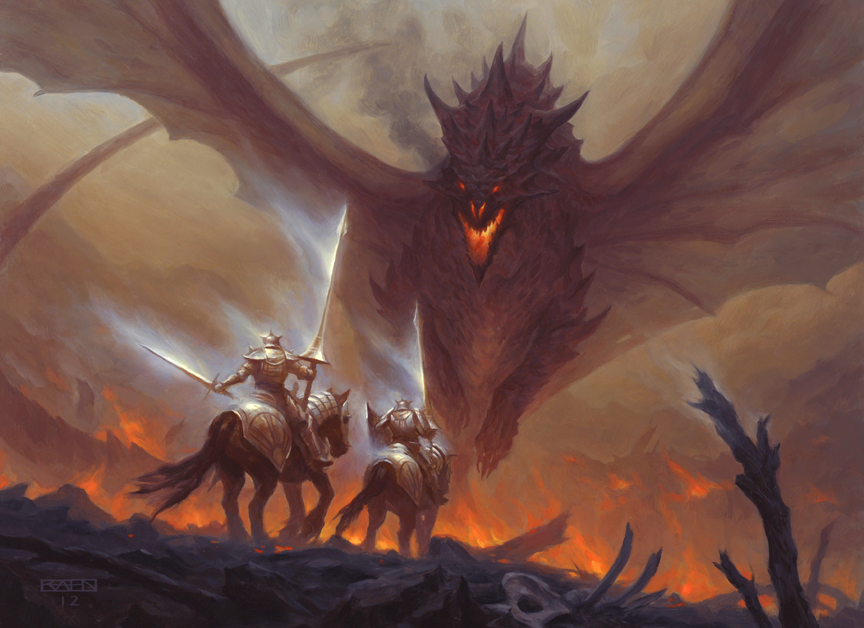
Image

Maybe I missed it, but I'm surprised no one has brought up the importance of how our individual art tastes influence our aesthetic opinions. Inevitably, some people will like certain styles, some people won't. I would instead have a conversation about WHY I like so-and-so's art and what pops out to me as aesthetically successful, which some of you have done :]

However, calling any art "soulless" immediately degrades the conversation into the same chasm where the classic "playing guitar fast is soulless" argument resides (which I believe was conveniently brought up).

Image

Some of you might know me from my Magic art Tumblr blog, but if you don't, I'm an art student who happens to love ALL Magic art. The great thing about the different eras of Magic illustration is that you can tell a lot about the game's aesthetic progression by appreciating its artistic evolution. This is not meant to qualify whether the art has gotten "better" or "worse", only that it has evolved to fit the needs and demands of a constantly changing mechanical landscape.

Personally, as a fervent Vorthos, I really appreciate Jeremy, Brady, Richard, and all of Creative's constant push toward a more unified concept for each new story setting. A big part of this, of course, it also unifying the artistic look of each set and block. With Theros as the most recent example, that means many motifs, color palettes, costumes and silhouettes are inevitably repeated throughout the set/block's design. Yes, things will look slightly similar from card to card as a whole, but it also means you will easily be able to identify the plane of Theros as a story setting.

Image

As an animator, I see the Magic card art frame much less like a canvas, and much more like a screen. That is, a window into a constantly shifting and engaging Multiverse. That's why I love this game so much.

In short: art changes. Visual tastes change, techniques change, the industry changes. However, what doesn't change, things like good composition, good story-telling, good visual movement, are much higher on the aesthetic scale, and should therefore be the focus of our criticisms.

Bless you, friends :]


Like this post
Top
 Profile  
 
PostPosted: Wed Oct 09, 2013 3:49 am 
Offline
Member

Joined: Sep 22, 2013
Posts: 12283
In fairness Art (because you are totally going to be stuck with that nom de plume) I brought up the idea of both subjectivity and objectivity in the discussion.
While subjectively, there is art that resonates with people, it doesn't make it objectively good. That's true of a lot of the earlier works, but we went on about composition and movement being very important. Then the idea of "details" came up and things just kind of fell apart again. :roll:

You do bring up a fun thing though, in that in the newest DotP we actually have animated cards. Similarly, the cards are so easy to use for the trailers simply BECAUSE they are a small moment in time frozen for our consumption.

_________________
At twilight's end, the shadow's crossed / a new world birthed, the elder lost.
Yet on the morn we wake to find / that mem'ry left so far behind.
To deafened ears we ask, unseen / "Which is life and which the dream?"


Like this post
Top
 Profile  
 
PostPosted: Wed Oct 09, 2013 4:08 am 
Offline
Member
User avatar

Joined: Oct 09, 2013
Posts: 7
Honestly, that's what keeps me enthralled in Magic illustration. A good Magic artist, and really any good fantasy artist, can take a still image and convey an entire world, culture, and story with just that image.

In school, we talk a lot about the "world-window". I think modern Magic pieces use that concept very well, and as a hungry Vorthos, I feel very spoiled :]


Like this post
Top
 Profile  
 
PostPosted: Wed Oct 09, 2013 5:03 am 
Offline
Member

Joined: Sep 24, 2013
Posts: 8786
What are the three cards that you posted the art of?


Like this post
Top
 Profile  
 
PostPosted: Wed Oct 09, 2013 5:31 am 
Offline
Member
User avatar

Joined: Oct 09, 2013
Posts: 7
Flopfoot wrote:
What are the three cards that you posted the art of?


That would be Path of Bravery, Vaporkin, and the newest Judge Promo version of Vindicate, respectively.


Like this post
Top
 Profile  
 
PostPosted: Wed Oct 09, 2013 1:04 pm 
Offline
Member

Joined: Sep 22, 2013
Posts: 4859
Identity: genderqueer
Preferred Pronoun Set: zie/zin/zir/zirs/zinself
Hey, Art! :D Good to see you here!


Also, wait, in DotP there are animated cards? That's interesting 0_o


Like this post
Top
 Profile  
 
PostPosted: Wed Oct 09, 2013 1:20 pm 
Offline
YMtC Champ '05
YMtC Idol Winner

Joined: Sep 23, 2013
Posts: 4668
KeeperofManyNames wrote:
Also, wait, in DotP there are animated cards? That's interesting 0_o
Yeah, a select few from each deck. It makes me want to keep the cards in the deck even when I feel like I should take them out.

They also vary. Some of them are really just "start on zoomed-in part of art, zoom out" but like Giltspire Avenger is great because the camera pans around the column as the Avenger cleans his sword. While Behemoth Sledge just spins around in place (which is cool in that they had to do the art of the whole object, but visually uninteresting).


Like this post
Top
 Profile  
 
PostPosted: Wed Oct 09, 2013 3:56 pm 
Offline
Member

Joined: Sep 22, 2013
Posts: 12283
DS wrote:
KeeperofManyNames wrote:
Also, wait, in DotP there are animated cards? That's interesting 0_o
Yeah, a select few from each deck. It makes me want to keep the cards in the deck even when I feel like I should take them out.

They also vary. Some of them are really just "start on zoomed-in part of art, zoom out" but like Giltspire Avenger is great because the camera pans around the column as the Avenger cleans his sword. While Behemoth Sledge just spins around in place (which is cool in that they had to do the art of the whole object, but visually uninteresting).

Behemoth Sledge is probably one of the absolute worst because it is clear they just skinned a very basic polygon model and then repeated the background over and over again.
I really really love Celestial Mantle though, because it shimmers. Doesn't do anything else, but it looks awesome regardless.

_________________
At twilight's end, the shadow's crossed / a new world birthed, the elder lost.
Yet on the morn we wake to find / that mem'ry left so far behind.
To deafened ears we ask, unseen / "Which is life and which the dream?"


Like this post
Top
 Profile  
 
PostPosted: Sun Oct 13, 2013 10:56 pm 
Offline
Member
User avatar

Joined: Sep 23, 2013
Posts: 859
Location: Indy
While Butt is a troll, I can agree with a bit of his sentiments, just a bit though.

There is a certain feel with each era, that is hard to replicate.

_________________
Yuri is best girl!


Like this post
Top
 Profile  
 
PostPosted: Sun Oct 13, 2013 10:57 pm 
Offline
Member
User avatar

Joined: Sep 23, 2013
Posts: 859
Location: Indy
I also couldn't post the image I wanted, maybe I'll upload it to Photobucket or something, idk.

_________________
Yuri is best girl!


Like this post
Top
 Profile  
 
PostPosted: Sun Oct 13, 2013 10:59 pm 
Offline
Member
User avatar

Joined: Sep 23, 2013
Posts: 859
Location: Indy
Flopfoot wrote:
Taking a closer look at Magic art because of this thread. (Only a few sets ago I started looking at the visual spoiler for the art and not just reading the card mechanics. However, I think the art was always something that subconsciously drew me into the game. It was when Shards of Alara came out that you could not help but notice the art and whether it's true or not I really felt like they started to put more effort into it around that time).

The original moxen have pretty cool backgrounds, something I didn't notice before.

Dan Scott's got some good pieces and certainly not visual adhd. Edge of the Divinity and Feudkiller's Verdict are pretty awesome.

Sometimes I really like the weird stuff like Wall of Light and Voice of All. A recent card I like is Polis Crusher, the perspective is perfect.

I remember that there was some pretty horrible art back in the day so I decided to have a look at The Dark. I think I didn't go back in time far enough but oh well, found examples of good and bad here. Obviously there is the iconic Blood of the Martyr and Elves of Deep Shadow, but I picked a few others to look at.

Fellwar Stone looks like something I could have done, but it's probably a lot harder than it looks.
Carnivorous Plant is kind of iconic, at least I remember seeing it a lot as a kid. I like the color scheme but it could be a bit bolder.
Book of Rass is not very good. I guess the art description is a book flies off a library shelf towards the viewer. They could do a lot better with that description these days.
Festival has horrible colors, even if people in festivals really did sort of look like that back in the day.
Flood is cool.
Psychic Allergy is good and bad. Something seems wrong with the facial expression.


Also the Dark is awesome because Jesper Myrfors, the original art director for Magic, spearheaded the set, which is also the unusual coloring of the expansion (colors faded, black and white bolded).

_________________
Yuri is best girl!


Like this post
Top
 Profile  
 
PostPosted: Sat Oct 26, 2013 9:27 am 
Offline
Member
User avatar

Joined: Sep 24, 2013
Posts: 1832
Location: Trading people for smokes.
Thrull Champion wrote:
While Butt is a troll, I can agree with a bit of his sentiments, just a bit though.

There is a certain feel with each era, that is hard to replicate.

I am not a troll. "Waaah he thinks modern Magic art is bad this obviously makes him a troll."

_________________
Gehennah, true kings of poseur-slaying wrote:
Suddenly she stood there close to me, a woman too grotesque to even be
I felt quite dim but I was still aware, that I was too drunk to see or care
I said "Baby, metal is what I need; not some bloody ***** to feed"
She looked at me with stupid eyes, then I gave her my advice

"Piss off, I'm drinking! Piss off, or die!
Piss off, I'm drinking! Piss off, or die!"


Like this post
Top
 Profile  
 
Display posts from previous:  Sort by  
Post new topic Reply to topic  [ 74 posts ]  Go to page Previous  1, 2, 3, 4

All times are UTC - 6 hours [ DST ]


You cannot post new topics in this forum
You cannot reply to topics in this forum
You cannot edit your posts in this forum
You cannot delete your posts in this forum
You cannot post attachments in this forum

Jump to:  
cron
Powered by phpBB® Forum Software © phpBB Group